
ultraPacer’s Race Overview
Race overview is a tool that allows ultramarathon spectators to view current progress and projected finish times for runners during a race.
As Lead Designer, I designed the end-to-end vision for this feature launch.
TIMELINE
May - June 2025 (4-week sprint)
USERS
Ultramarathon spectators
TEAM
Lead designer, lead engineer, front end engineer
SCOPE OF WORK
product and content design | UX research | product strategy
Background
In 2025, ultraPacer launched a spectator feature for one of our sport’s biggest races:
Western States
Western States is like the Boston Marathon-meets-the Super Bowl for North American ultra runners

In the past, spectators followed the race online with waypoint arrival tables and X-posts
In 2021, the race started an official livestream on YouTube
In 2024, the livestream got over 281,000 views
Livestream Pain Points
The livestream tells a story by asking two questions:
Will anybody set a new course record?
Who will finish on the podium?
The 2024 livestream experience was not optimized for busy spectators tuning in periodically
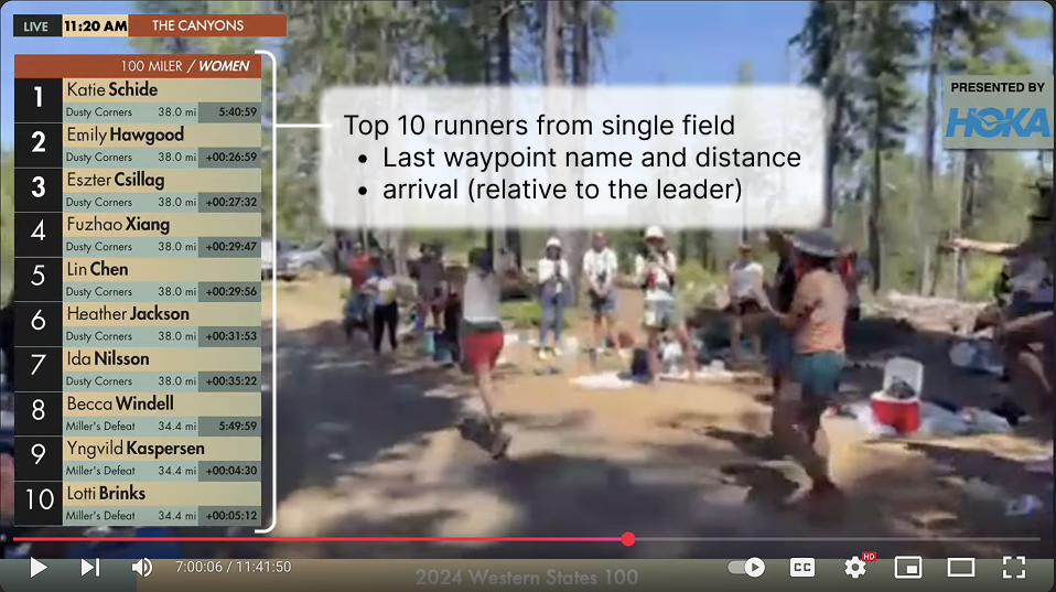
It displayed limited data beyond past waypoint arrival times. Spectators lacked context from missed commentary

The Opportunity
We felt we could convert Western States spectators to ultraPacer users by improving the spectator experience, turning race day excitement into product engagement during and after the event.
We hoped this feature would lead new users to our core feature: creating plans for ultramarathons

Target Users
Spectator

The spectators are mostly ultra runners balancing weekend training runs/activities with following a world class race.
Spectators tune in and out during the race - 14-30 hours
a mobile-friendly tool
a digestible snapshot of race standings
insight into arrival times vs. course record times
Needs
Livestream Hosts

The hosts are elite runners with intimate knowledge of the course and competition. They broadcast continuously all day, following athletes in disparate sections of the course.
Hosts report through Men’s/Women’s top 10 finishes - 18+ hours
simple data presentation for quick insights
equal depth of data for all athletes
pre-analyzed data to alleviate cognitive load
Needs
Design Phase 1:
Livestream Widget
The 2024 livestream contextualized performances using historical arrival times, course features, and race day conditions
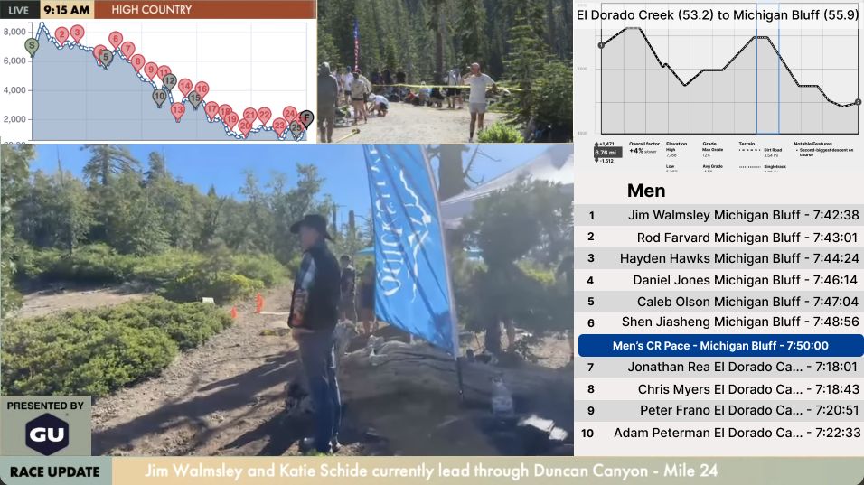
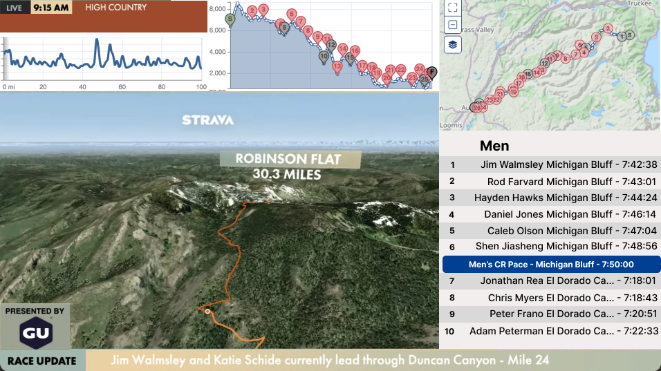
My sketches displayed relevant data, using existing elements of ultraPacer’s plan page
ultraPacer can also project waypoint arrival times, current position, and who might break a course record using live data
These quickly contextualize performances for the spectator and provide key insights for the livestream hosts

Primary User
We reached out to the livestream team before proceeding with more design and early engineering work


But we didn’t get a response

So we refocused on addressing the Spectator’s needs on ultraPacer
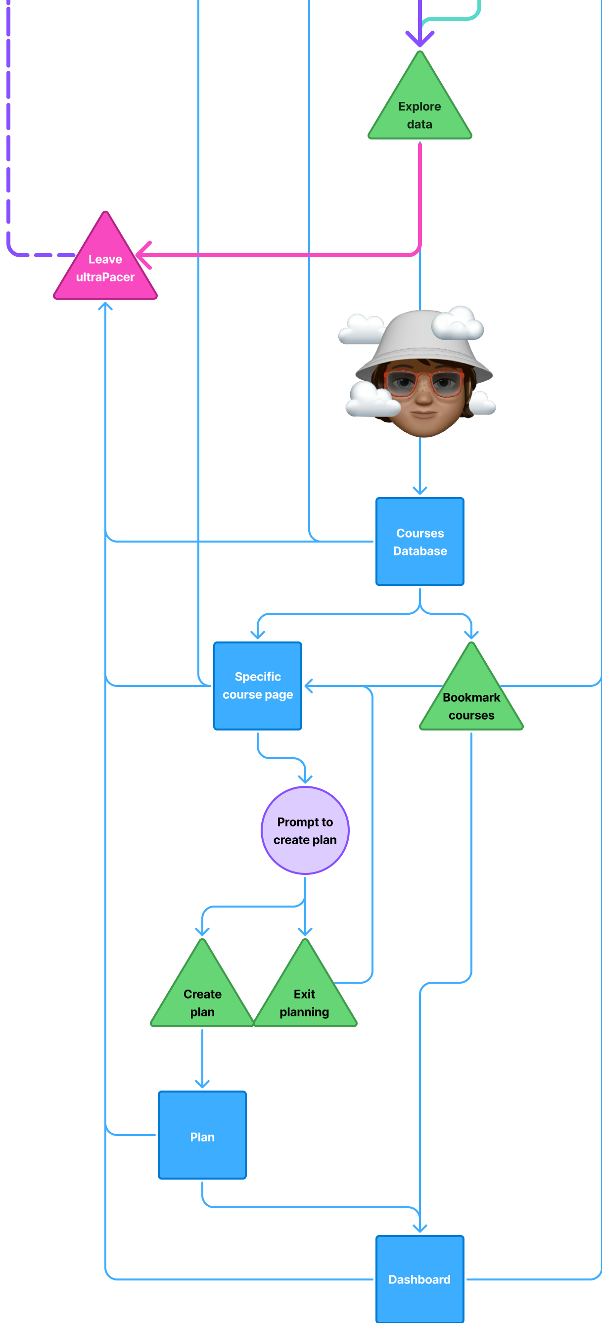
User Journey Part 1:
Race Overview Loop
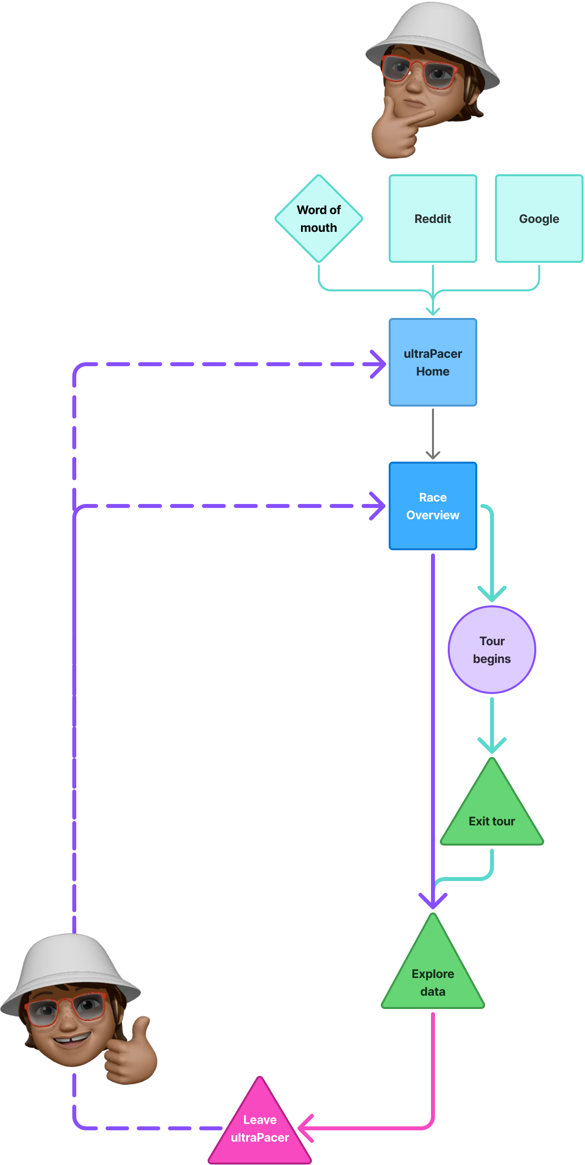
Our journey starts on race day…
The spectator wonders about the race,
learns of ultraPacer’s spectator feature,
and begins the Race Overview experience;
the feature is introduced,
the spectator curates their experience per their interests,
and then returns to training or other Saturday activities
If that experience is good, they return periodically as the race unfolds
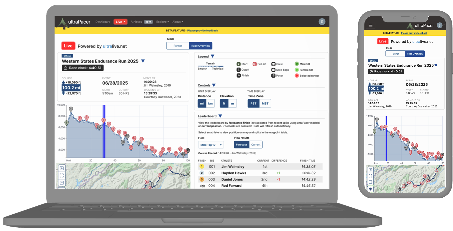
Final Designs
ultraPacer is a data-heavy product, and we were preparing for many first-time users. Race Overview was designed as an introduction to the product by building new elements into the existing plan page
Tour Design
A tour launches upon first visit, which I designed using the following principles:
highlight the most useful features
introduce them in order of expected use
minimize copy
minimize and broadcast the number of steps
minimize friction by allowing navigation and exit

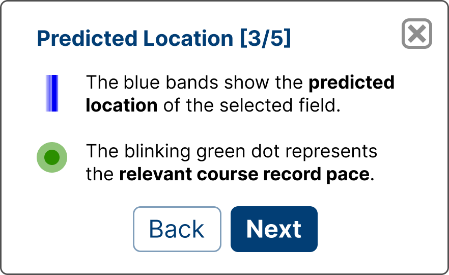

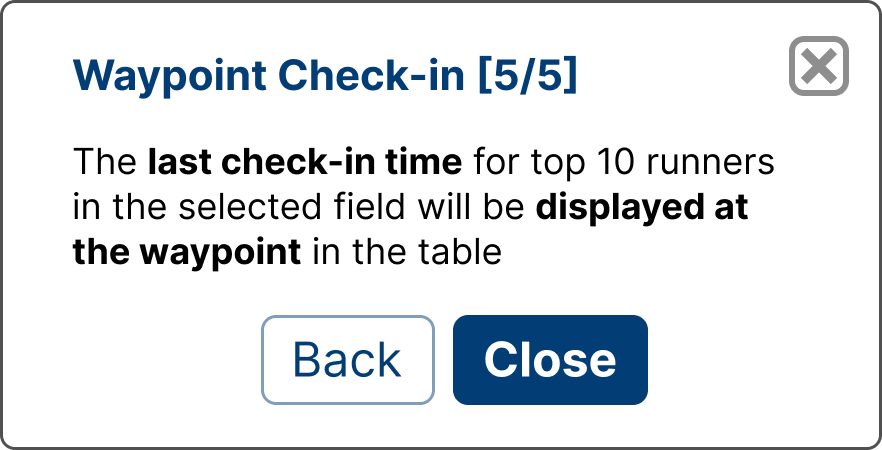
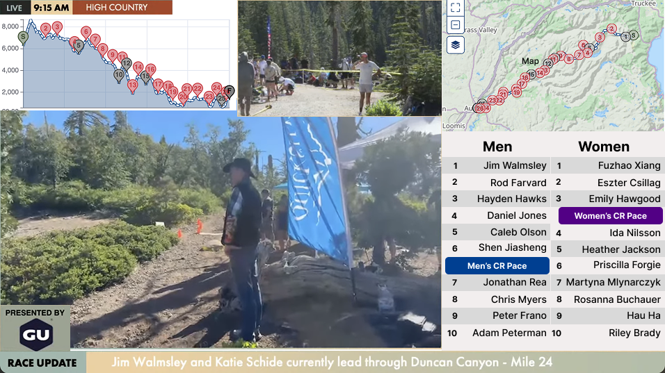
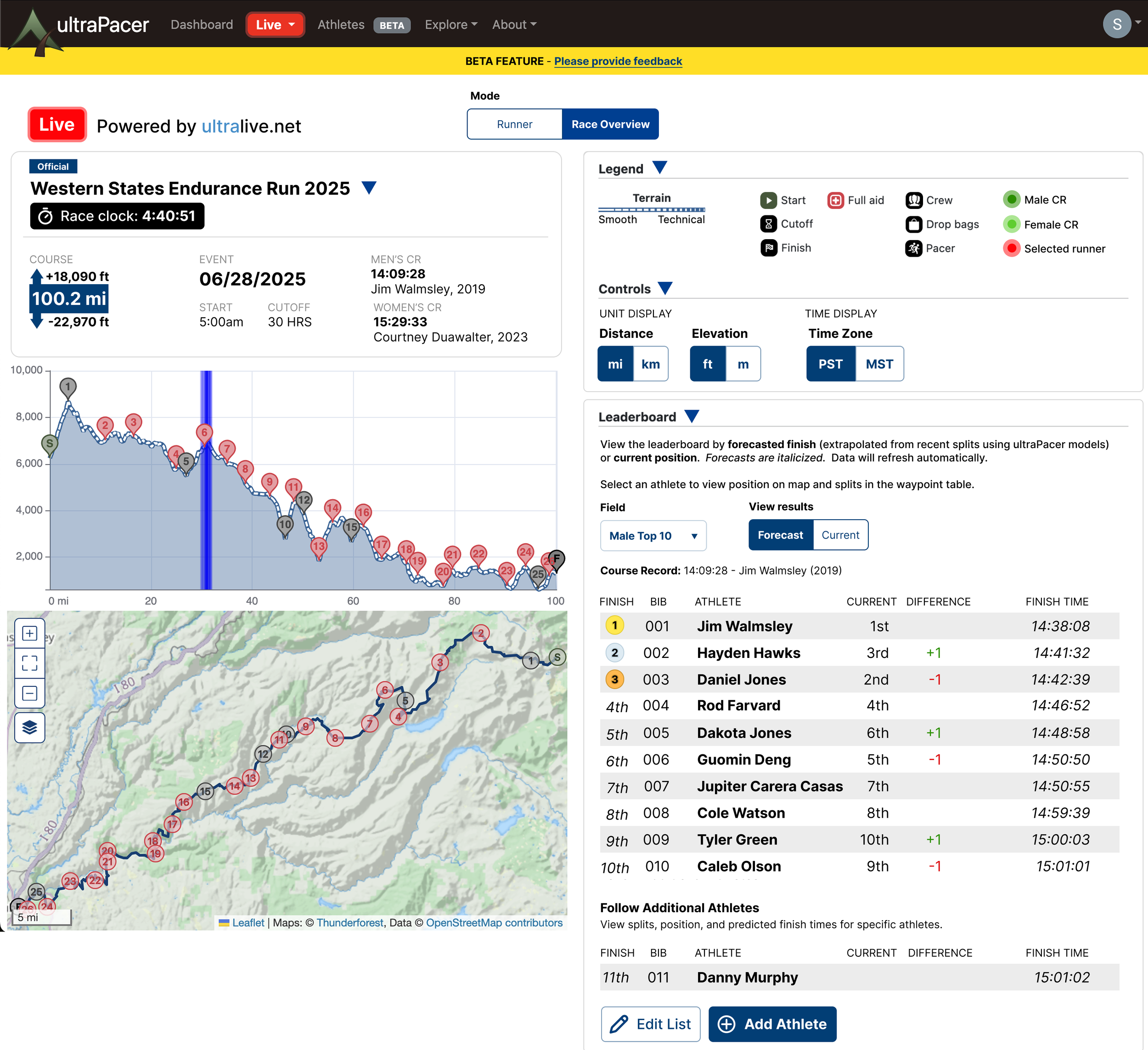
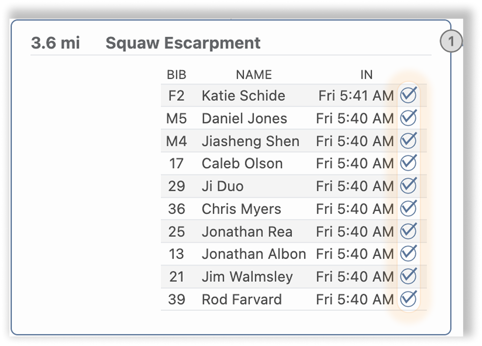
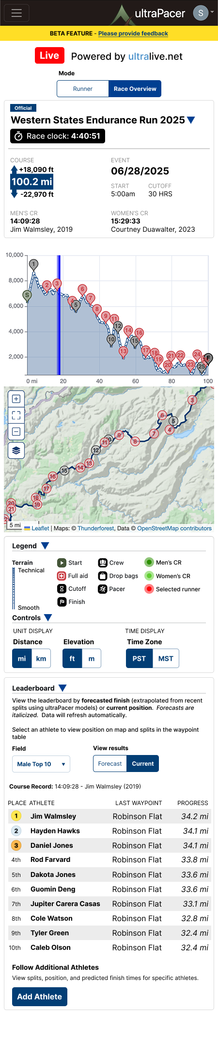
The key element of Race Overview is the leaderboard. Spectators can view top 10 runners for a field by forecasted finish or current position. Confirmed arrival times are provided by the official timing company’s API.
The default view, Forecast, highlights ultraPacer’s calculations and provides insight into the course record conversation
Leaderboard Design
This satisfies 2 of the Spectator’s needs:
a digestible snapshot of race standings
insight into arrival times vs. course record times

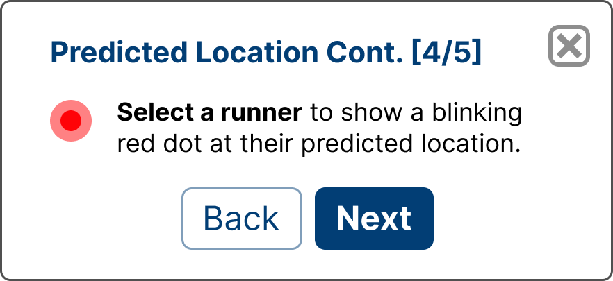
Users can follow specific athletes and see their results displayed like the leaders.
This satisfies the hosts’ unique need:
equal depth of data for all athletes


Content Design Insight

To distinguish projected and confirmed arrivals, we tried using icons. They added too much visual noise to already-crowded tables
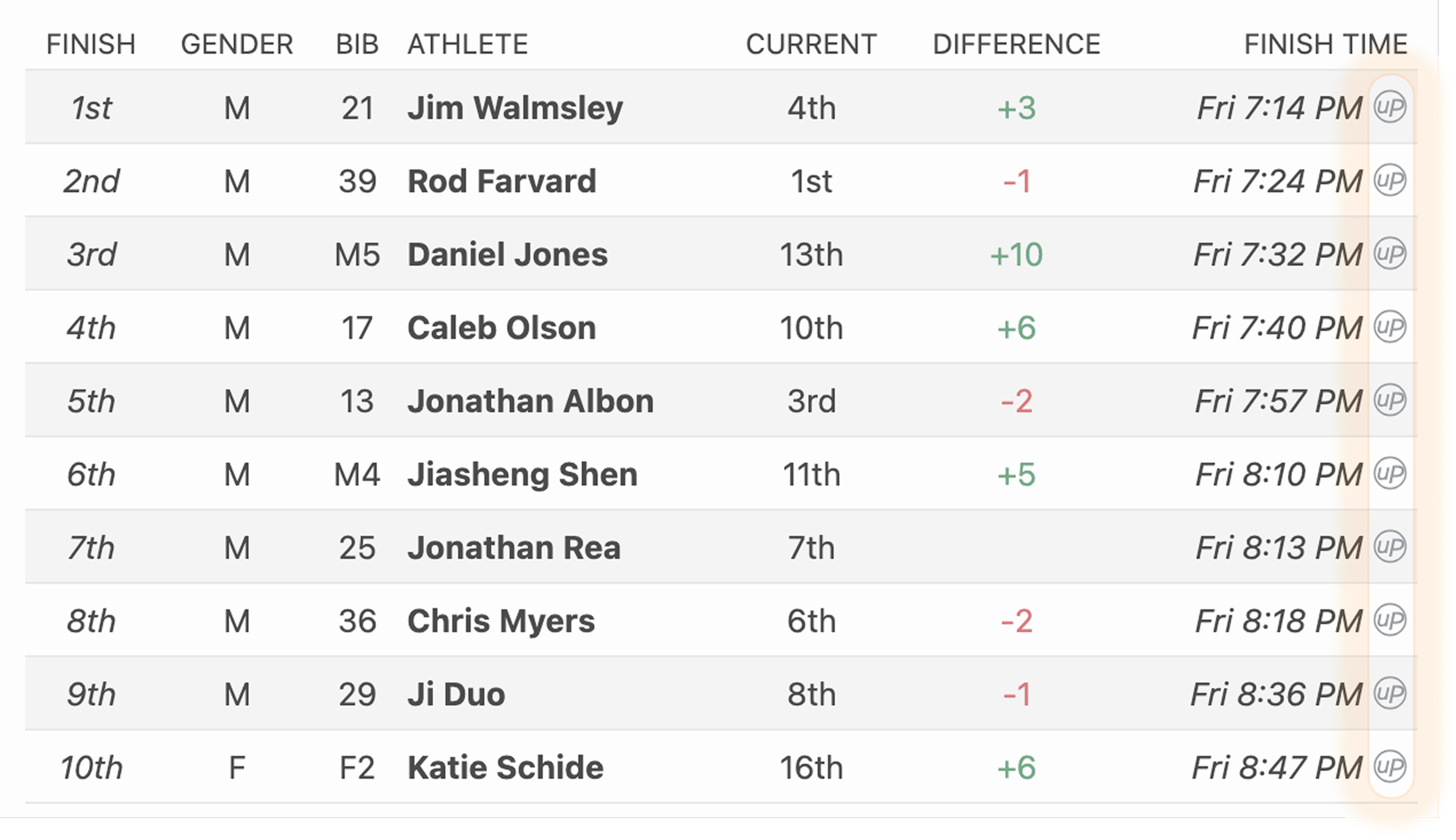
Instead, we used font styles:
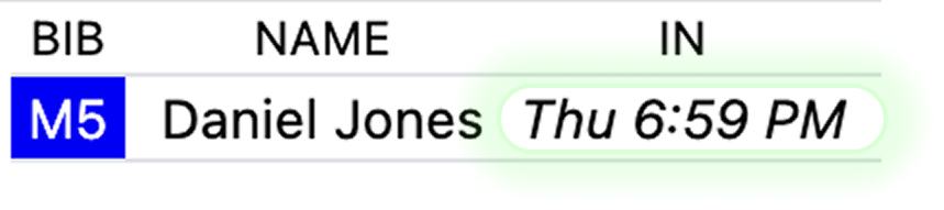
Italics indicate ultraPacer’s projection, which are also used for estimates like location
Unformatted/Roman font signifies confirmed
ultraPacer is a responsive website, so Race Overview can be used on any device anywhere with internet access.
The Spectator and Livestream Hosts have overlapping needs for digestible data and insights, so…


All 3 Spectator needs are met
a mobile-friendly tool
a digestible snapshot of race standings
insight into arrival times vs. course record times
AND
all 3 Livestream Host needs are met as well
simple data presentation for quick insights
equal depth of data for all athletes
pre-analyzed data to alleviate cognitive load
Best of all, this is a new gateway for new users to discover ultraPacer and a tool to familiarize them with main interface features and layouts.

User Journey Part 2:
Exploring ultraPacer
Our larger goal was retaining spectators as new users
We expected them to return to ultraPacer multiple times and hoped some spectators would explore the site at least once
I expected them to view the Courses Database first.

User Insight
US users tend to request a missing course rather than create it; therefore, searching for a course is a first step to creating a plan.
Engagement on the Courses Database was our goal - an indicator of potential future engagement/user retention

Strategy Insight
I ran a parallel sprint with our front end engineer to update the Courses Database page before launch. We added polish, UI consistency, and a bookmark utility to encourage future engagement.
Launch Success
We expected a massive spike in users on race day. 2,464 unique spectators used Race Overview during the race. While substantial for us, this was less than 1% of the potential audience based on livestream numbers.
Spectators viewed the page 4.25 times on average, spending 4:15 per visit. We viewed this as very successful. In the limited feedback we received, the feature was very well-received by users.
Race Overview Loop
There was no significant increase in engagement with the Courses database, nor an increase in plans created during the race. Users were not incentivized to explore further during the event.
Exploring ultraPacer
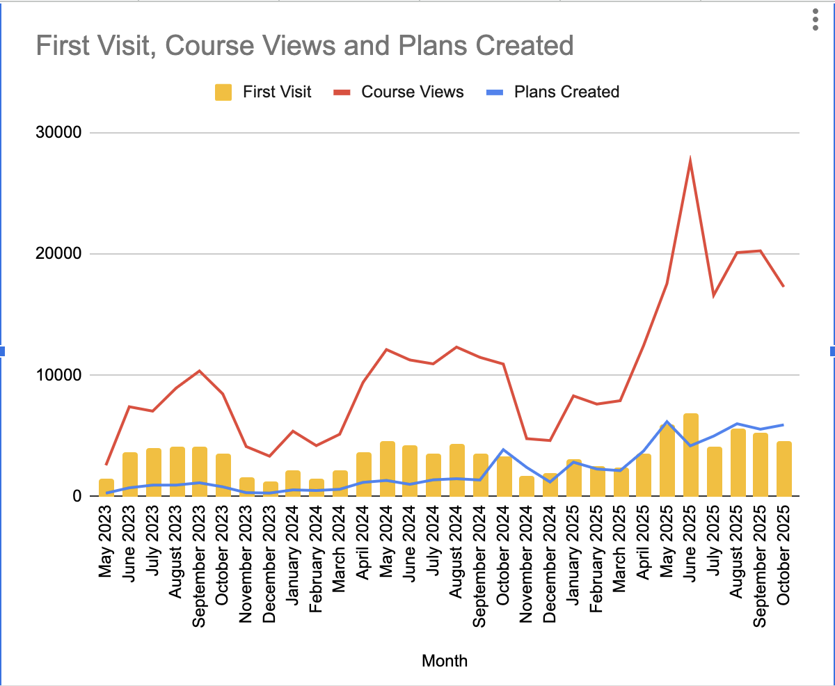
Growth far outpaced YOY trends following the event
While we didn’t see the expected indicators of user retention on race day, trends in course views, plans created, and first visits suggest that this launch successfully converted new users and got the ultraPacer name out to more people.
Growth and Retention
Next Steps
We discovered some limitations from user feedback and mid-race developments. It lost utility after the top 10 runners finished and it didn’t reflect runners dropping out mid-race. Updates will cover these and some UI cleanup to improve mobile display.
Our biggest area of improvement was outside of the product itself - marketing. Advertising to increase viewership and running a promo during the event to encourage exploration and paid subscriptions are planned for 2026.
I’m really proud of what we accomplished, and I particularly enjoyed the product strategy element of this launch; I’m excited to explore strategy further. From the radical pivot in approach to planning for a longer user journey, it was a thrilling ride through this 4-week sprint.