
Surfacing an Undiscoverable Album
Philadelphia indie band cellars released their first full-length album in July 2026 with no internet presence outside of streaming platforms.
I established an online identity for the band to boost SEO, make the band more discoverable, and lay a foundation for future promotional opportunities.
TIMELINE
July - August 2026 (initial 2-week sprint); ongoing social media management
AUDIENCE
Indie rock fans (Millennial/Gen Z), record label A&R, Spotify editors, radio staff
ROLES
Brand designer, content and web designer, social media manager
SCOPE OF WORK
logo and brand design | content and web design | competitive research | social media management
I offered a package of services, requiring minimal effort and budget, to support the band’s goals. The scope of work included:
developing a brand for the band
establishing a cohesive online identity across a new website, Instagram, and streaming platforms
managing social media, including creating and posting promotional content
Summary:
Surface the band in searches by name and additional keywords (search engines, streaming platforms, and social media)
create a brand around existing releases and media
Goals:
The Problems
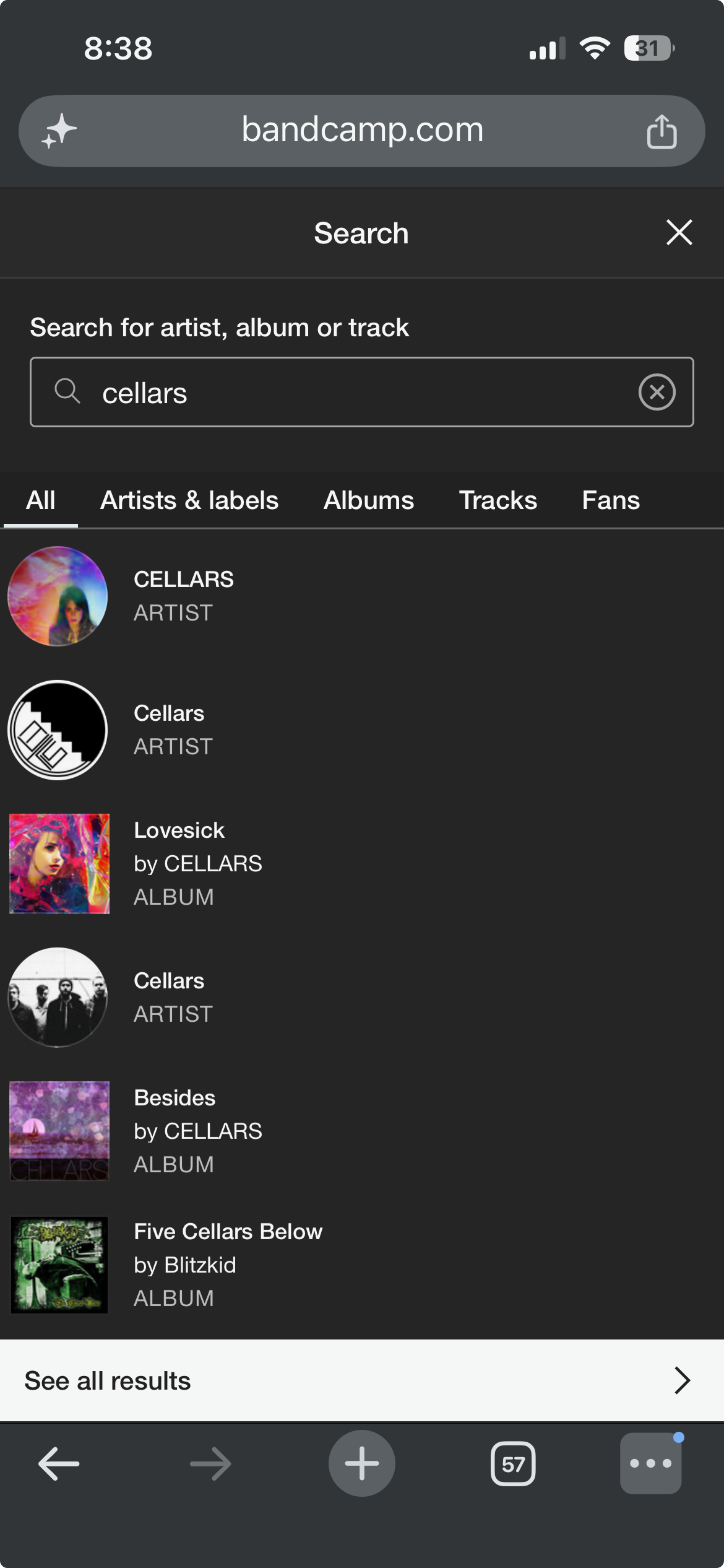
The band was buried in search engine results - “cellars” had become a common artist name
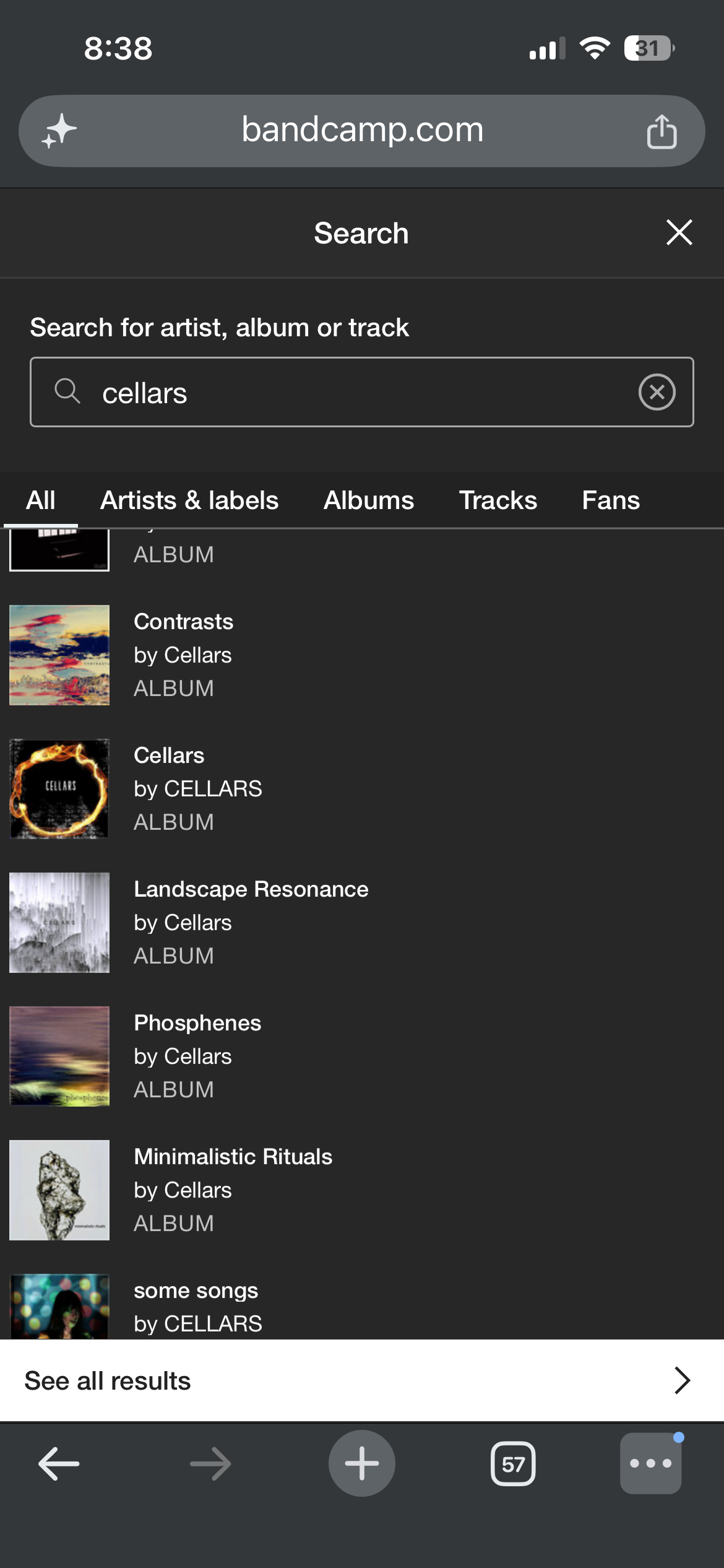
cellars released their first EP in 2012, then lay dormant until releasing the album with no rollout or promotion in 2026. In the years between, many artists have used some form of the name “cellars.” Some of those artists have regularly put out music and maintained a social media presence, which makes their music and links more relevant in search results.
The album was hard to search for - the title lacks unique keywords
“album,” “LP,” and “self-titled” are all apt terms for the 2026 release, but they weren’t keywords that would help surface relevant links. Without a track title, new listeners could only search “cellars” to find the album, compounding the issue with the common name.
The band was hard to identify online - they lacked a visual identity
The album art for “cellars ep” and “cellars” (the album) have nothing in common visually and the band had no logo or profile picture on streaming services, which made it difficult for listeners to identify the right artist and music when searching.
The band wasn’t on the first two pages of search results on Google or Bandcamp


Insights
The members of cellars are spread between NYC and Denver, making common promotional materials limited and difficult to create. Social media content for indie rock artists typically showcases live performances, professional shoots, and candid pictures and video.
Client insight:
The band did not set metrics of success. The only goal was laying a foundation for future release promotions on a limited budget with limited involvement from the band.
Client insight:
A cohesive and active online presence would help grow the band’s audience:
Instagram posts and website content would boost SEO with intentional-but-organic use of keywords and links to the music
Regular posting would build and maintain momentum by keeping the band visible and giving fans a low-effort way to share the music to their followers.
Hypothesis
Solutions
I wanted to launch the website and Instagram account with a defined brand in place, so I used the initial client meeting to establish direction and parameters for the branding. I got a sense of their humor, internal dynamics, and how they thought about their music, all of which informed the work.
Branding
Wordmark Logo
Listeners often compare cellars to the Strokes, so I looked to their logo for inspiration:
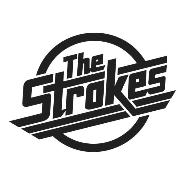
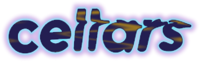
The logo matches the music - bold, edgy, polished, with tightly interwoven elements
cellars’ music is clean and meticulously crafted, yet mellow, textured, and psychedelic; I wanted that to come across in the wordmark.
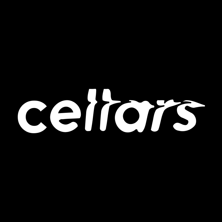
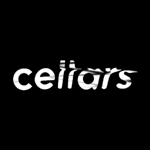
Starting with a clean, modern font, I progressively warped the text while retaining legibility
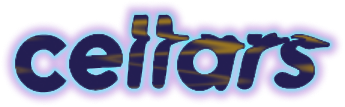
This colorway, which borrows its palette from the album cover art, became the default profile pic logo
Other than the wordmark, the only official stylized text was the title on the EP cover art. These two styles of type are used throughout the website to create a cohesive look to visual assets both old and new.
Typography
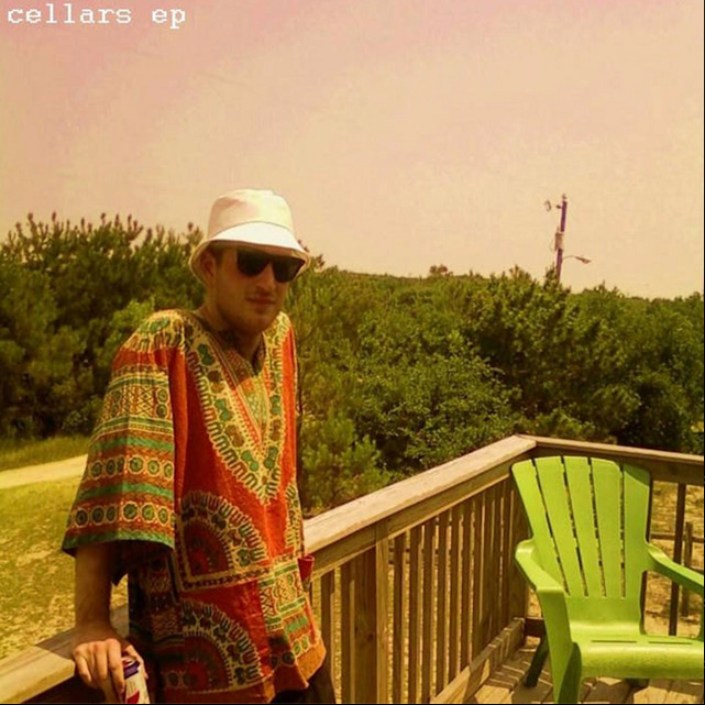

The pixelated heading font references the EP cover
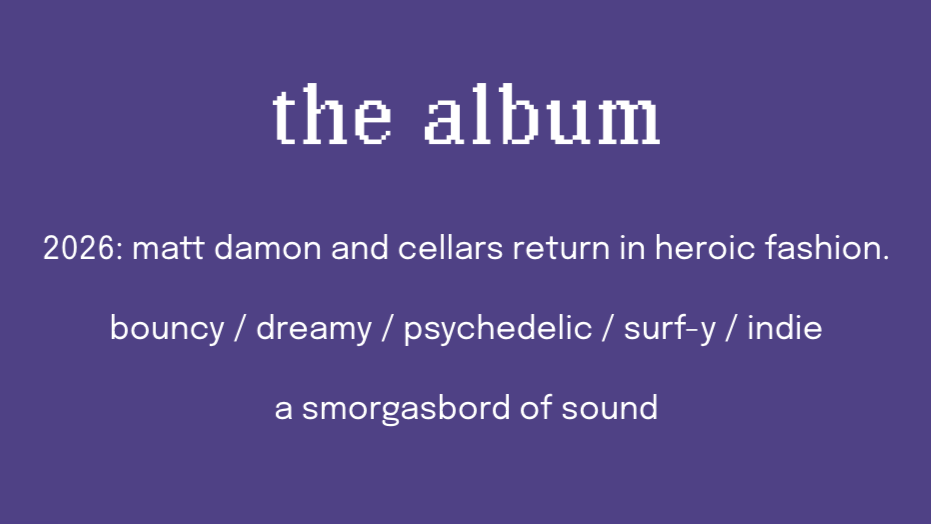
Body text is a modern typeface similar to the logo
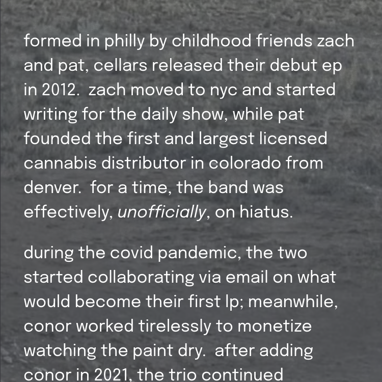
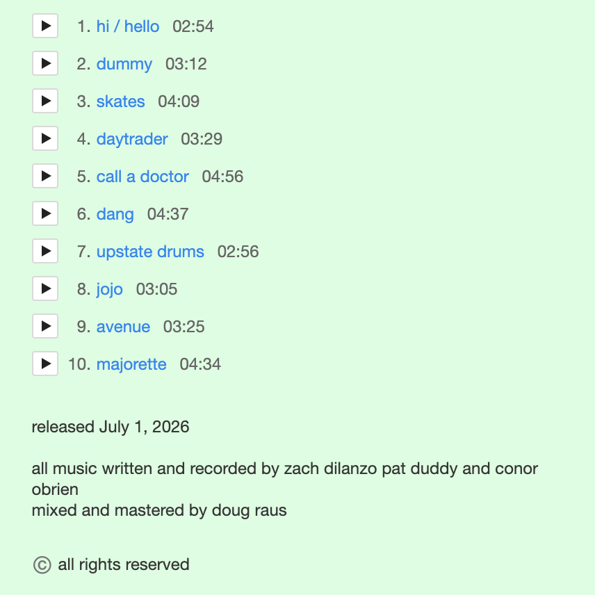
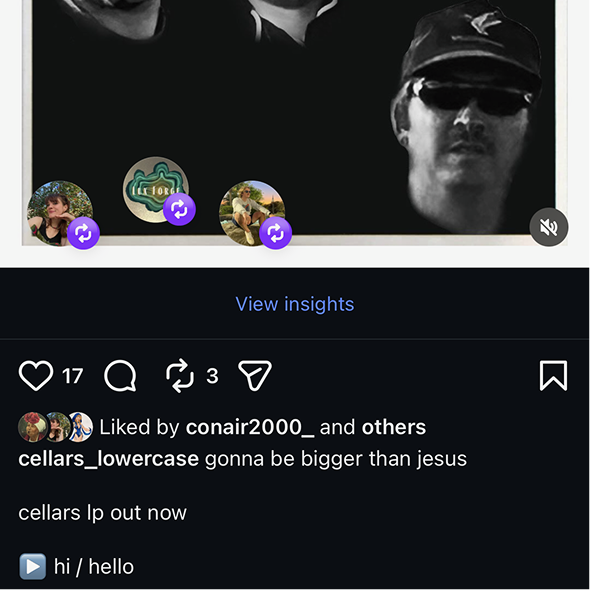
The band had joked that they were the only “cellars” stylized in lowercase. I made that part of the brand.
From the wordmark,
to the website bio,
to track titles and notes,
and Instagram captions,
lowercase is a unifying stylistic choice across all platforms
Additional Aesthetic Choices
The predominant palette on the site, like the “profile pic” wordmark, relates to the cover art of the recently-released album, signifying that it’s the band’s most important work. The palette is made up of purples and indigos, with mostly white text and icons.




Animated filters were used extensively on images across the website to:
convey the psychedelic nature of the music and
lean into millennial/gen Z (the target demo) appreciation for early internet kitsch (which carried over into the approach to social media content)
Approach to SEO
cellars were competing for authority over their band name with nothing but sparse streaming pages on Bandcamp, Spotify, and Apple Music. Band members were scarcely mentioned by name, they weren’t associated with a specific genre or city, and there was no network of links connecting the few streaming pages to one another.
The website and Instagram profile were created to connect the dots and make the band searchable through various keyword combinations.
The website serves as a singular source of truth - a collection of keywords, links, and a basic impression of the band.
The Website

The site is simple - a landing page, a dedicated page for each release, a gallery to give it more life, an empty “tour” page as a cheeky nod to their geographic situation, and a bio on the about page.

The footer contains links to the Instagram profile and band pages on Spotify, Apple Music, and Bandcamp
The bio features genre keywords like “indie,” “rock,” “surf,” and “psychedelic,” to help people searching for the band with little context. The final lines of the bio are the band’s elevator pitch, which they can use when reaching out to labels and radio. The elevator pitch version also features on their Bandcamp profile.
The Bio
I aimed for consistency across platforms, even in the domains, so that multiple profiles would show up/be referenced in search results.
The band’s original Bandcamp domain was cellarsmusic.bandcamp.com; cellars-music.com was the closest available match for the website domain, and the Bandcamp was updated to cellars-music.bandcamp.com to mirror the website domain.
To make the Instagram handle more distinctive, I chose @cellars_lowercase, which is similar to the new band email - cellars.lowercase@gmail.com - and references the design language (which is spelled out in a banner on the website landing page).
Domains
Memes became the meat and potatoes of the Instagram content, because they:
are an economical use of a limited stock of band media
appeal to the target demo (Millennial and Gen Z listeners)
allow for a consistent cadence to posting and regular engagement
Instagram Content
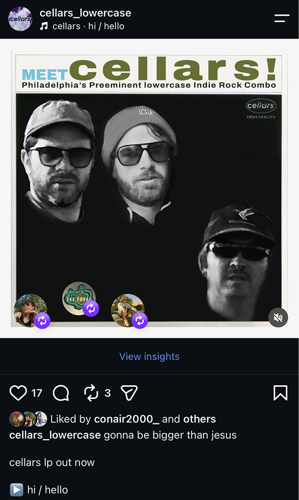
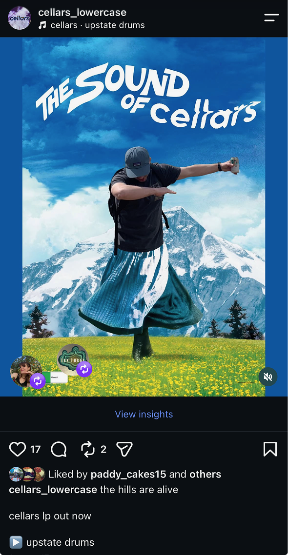
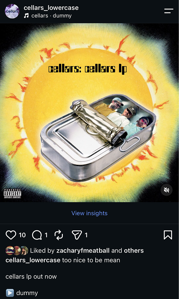
A joke is more likely to be shared than a picture of an unknown indie band hiking in New Mexico
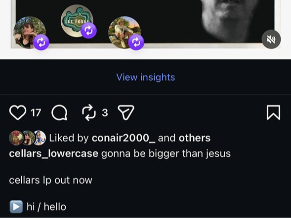
The meme captions are structured in three lines:
relevant quip
“cellars lp out now”
[track title]
This structure allows me to:
seed keywords associated with the band
guarantees traffic/ builds authority for the name “cellars,” and
creates easily-shareable assets to expand the band’s audience
The memes also serve as a “reverse rollout” for the album.
Memes consist of band members inserted into Philadelphia sports references, iconic pop culture images, and classic album art. They also imply a cellars persona without making statements on the band’s behalf.
Looking Forward
Brand assets and design language like the wordmark profile picture and bio will be added to other streaming platforms as I get access from the client.
There’s no easy way to track the impact of this newly-active instagram on streams in these first couple of months, but I expect continued posting (and post sharing) will help sustain monthly streaming numbers through followers’ networks.
This project was and continues to be very creatively satisfying. Weaving together disparate elements and building them into a cohesive brand was a really fun exercise and I’m proud of finding so many ways to stretch limited material into a fair amount of purposeful substance.
The memes themselves have been a nice way to study iconic images, learn about typefaces, and sharpen my eye as a designer. It’s pretty gratifying to see and hear the warm response to them.
I was a fan of cellars before I started working with them. I’m happy that starting this process got them thinking a bit more about being intentional with their approach to releasing their music and giving it a real chance to find its audience.